

MyHoliday App
UI/UX case study
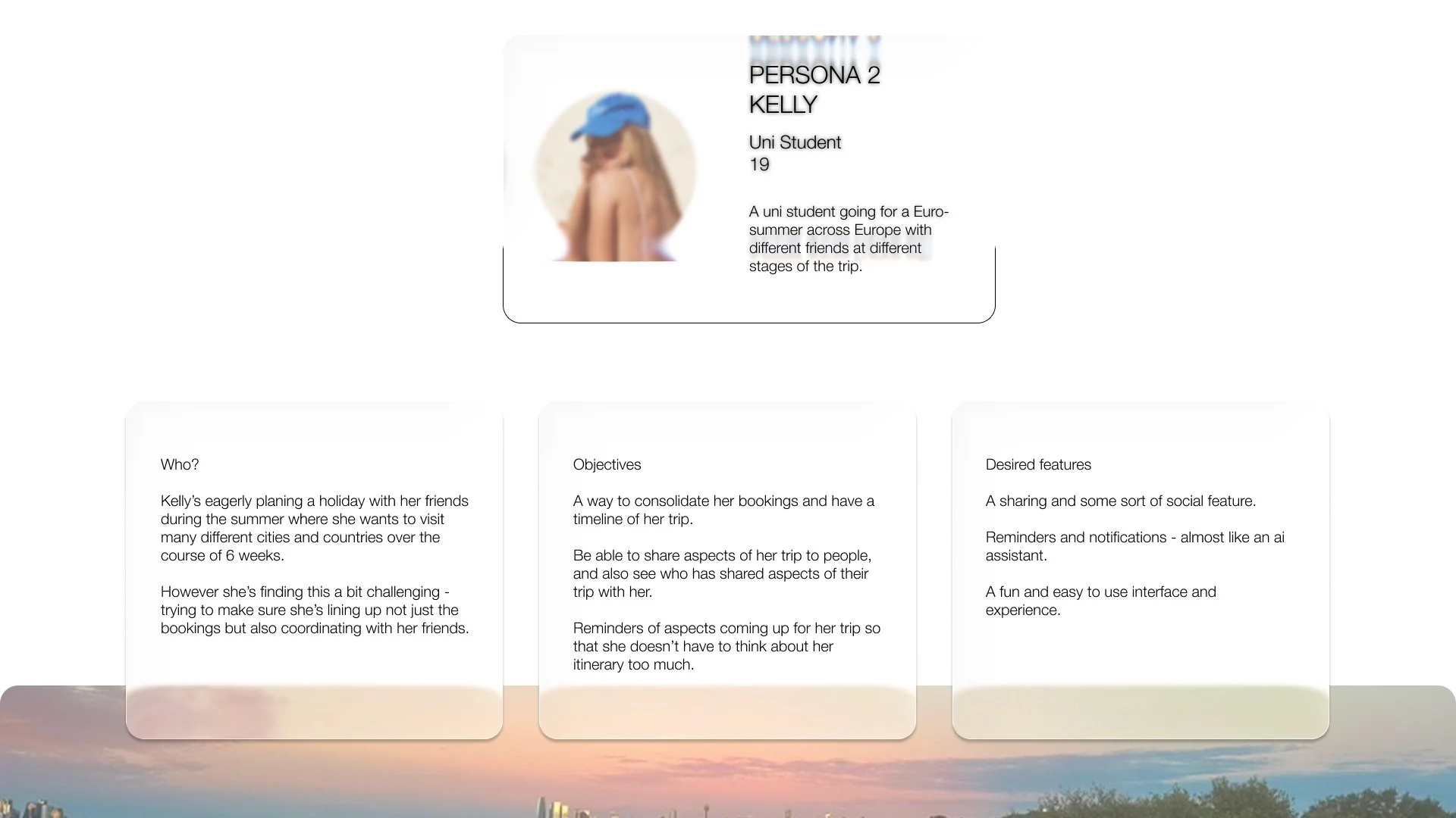
This case study was inspired by the often stressful experience of planning multi-destination holidays juggling flights, hotels, and itineraries across several cities. The goal of this project is to design a streamlined solution that brings all travel details together in one organised, easy to navigate space.

The Story
Project Goals:
The aim of this app was to create a seamless and intuitive way to track travel bookings, dates, and destinations while also making it easy to share trip details with others involved in the journey.
Role:
I led the end to end process from initial planning through to design and prototyping. The concept started as a quick sketch over a calendar app screenshot and gradually evolved into a fully structured interface, built around features I personally found lacking in existing travel tools.
Outcome:
After presenting the prototype to peers, the concept received strong, positive feedback highlighting its clarity, practicality, and potential as a user-friendly solution for group travel planning.
Have a play around with the prototype!

This section offers a quick overview of the core flow explored in this project. A key focus was on the value of providing multiple views for a user’s trip allowing them to see their holiday from different angles, whether chronological, map-based, or list based. By supporting different mental models, the design helps users more easily understand the structure of their trip and map out the order of events. The flow begins with the main holiday tile and moves into detailed itinerary views, offering flexibility and clarity throughout the planning process.


Notes: Here we have the three core components of the app: the Trip Home Page, the Location/Stay View, and the Calendar View. Each offers a distinct perspective on the holiday. The list view provides a clear overview of all destinations, helping users understand the structure of their trip. Meanwhile, the calendar view lays out each destination and booking over time—allowing users to visualise their itinerary in a more chronological, time-based format. Together, these views offer flexibility and clarity, supporting different ways of thinking and planning.

Notes: This screen provides a more in-depth look at the Location/Stay Page. The goal was to make key information easily scannable at a glance. Through personal experience, I found that the most frequently referenced details during a trip were the hotel name, stay dates, and location, so I prioritised these in the information hierarchy. This approach offers a faster and more user-friendly experience compared to traditional travel apps like Expedia, which often bury essential details in cluttered interfaces.

Notes: Here are additional examples of the Location/Stay Pages, each designed with its own distinct colour theme to help users easily identify and differentiate between destinations at a glance.
On the right is the Trip Home Page, where users can create and manage multiple holidays. Each trip can then be populated with its own set of destinations, accommodations, and travel details, serving as a central hub for planning and organisation.h their holiday details.